Another Oddball!?!?
I recently received yet another oddball cap. Everyone knows that from 1977 to 1982, the San Francisco Giants wore caps with orange visors. I already owned two versions of this cap: The regular on-field version made by New Era, and a version made by Roman. This cap is made by New Era but is slightly different than the one that I already owned. The front logo is slightly different, the visor is the "older" style, and the underside visor fabric is green. The Giants had switched to gray in the early 1970s.
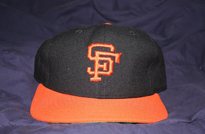

Below is a four-way comparison between Giants caps. From left to right, we have a KM Pro cap circa late 1960s/early 1970s, a Roman Pro cap circa 1977 to 1982, the "oddball cap" made by New Era, then the regular 1977 to 1982 version made by New Era.


When it comes to the orange-visor caps, the true on-field version is the one on the far right. Here is Vida Blue to demonstrate.

I figure this cap could be one of two things. Either it's a prototype, or it was just an uncommon version that was available at one time or another. One thing I am certain of is that this must be the prototype for the inaccurate "Cooperstown Collection" versions that are out there. Any thoughts?


Below is a four-way comparison between Giants caps. From left to right, we have a KM Pro cap circa late 1960s/early 1970s, a Roman Pro cap circa 1977 to 1982, the "oddball cap" made by New Era, then the regular 1977 to 1982 version made by New Era.


When it comes to the orange-visor caps, the true on-field version is the one on the far right. Here is Vida Blue to demonstrate.
I figure this cap could be one of two things. Either it's a prototype, or it was just an uncommon version that was available at one time or another. One thing I am certain of is that this must be the prototype for the inaccurate "Cooperstown Collection" versions that are out there. Any thoughts?


Maybe it was a leftover blank older Orioles cap?
ReplyDeleteThat era Giants cap always confused me and I had no idea which one was the official version. Probably was too subtle for anyone to notice the difference back then.
Just found your blog. Great work. I had some caps from the '60s & '70s, but wore them out (a shame). Found the Cooperstown Collection by New Era, but they just slap newer logos on older caps. For what it's worth I'd love to hear where I might find an Oakland A's 1970-72 cap (with the single point A's) and the 1973-80 cap (like in Paul's collection). Also the Orioles 1975-76 cap with the orange front. Paul maybe you can do a blog on the Orioles cartoon bird caps. There were three different cartoon birds that I know of: 1966-74, 75-76, 77-88.
ReplyDeleteSome of the batting helmets Giants players were wearing in the 1981 Topps set appear to have the alternate logo on the first cap pictured above. Here is one example:
ReplyDeletehttp://4.bp.blogspot.com/_D84Z7vc38Aw/SjkAA-hRgqI/AAAAAAAAA4k/V7gWjIBTDeY/s1600-h/81_topps_561_f.jpg