Team Cap History: Los Angeles/California/Anaheim/Los Angeles Angels of Anaheim
I have spent the past several weeks researching the Angels cap history and it proved to be rather interesting. If I am missing anything email me and I'll add it in. Response may be slow since I will be out of town until Monday. Ironically enough, I will be in Anaheim. A special thanks goes to Rob Loeffler and his website "Rob L's Baseball Memorabilia (http://loefflerrd.webs.com/angelsgameusedmem.htm)". Let's go!
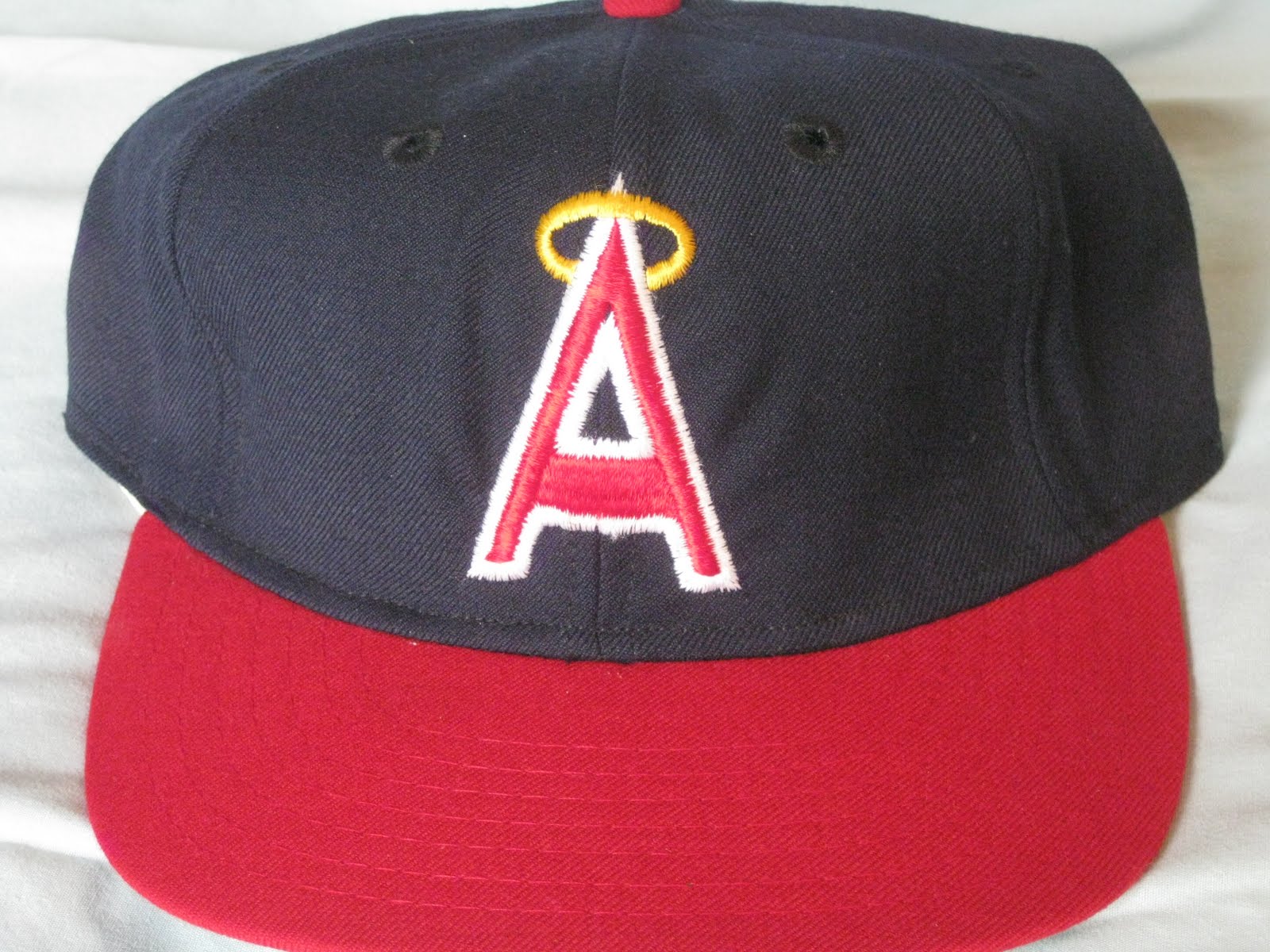
1961 - 1964
The first Angels cap. The team used Tim McAuliffe/KM Pro caps. I have seen New Era versions but I don't think any were ever used by the team. I *believe* I have seen versions without a halo. 100% accurate reproductions were later made by Roman and Mitchell & Ness, with American Needle offering their own version presently. I'm sure New Era has made them at one time or another but I have been unable to find one.

1965 - 1970
The team stuck with using Tim McAuliffe/KM Pro caps, with some being Leslie/KM Pro caps. This is the only Leslie/KM Cap that I have ever seen. There are New Era versions but again I don't think any were ever used by the team. There is indeed versions without a halo, I'm not sure when they were used but my guess it was in the later years. 100% accurate reproductions were later made by Roman, and just like the previous cap American Needle is offering their own version presently and I'm sure New Era has made them at one time or another but I have been unable to find one.

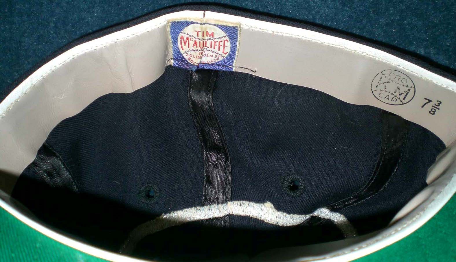
Tim McAuliffe/KM Pro Version

Tim McAuliffe/KM Pro Version interior

Leslie/KM Pro Version interior tags

New Era Version

New Era Version interior
1971
This one year style was again made by KM Pro (now sans the Tim McAuliffe name). I don't recall seeing a New Era version but I'm sure they exist. 100% accurate reproductions were later made by Roman, with American Needle and New Era offering their own versions presently.

Tim McAuliffe/KM Pro Version

Current New Era reproduction
1972 - 1988
There are many variations to this style. KM Pro made these caps probably until the mid 70s when they went out of business, but the switch to New Era may have been made earlier. New Era appears to have been the main supplier from then on. Sports Specialties and I *believe* Roman made on-field versions but I'm not sure if the team used them at all. 100% accurate reproductions were later made by Roman, with American Needle and New Era offering their own versions presently. There are some interesting differences between the New Era on-field versions. Some appear to have the older, smaller/narrower visors. A 70s new Era version I personally own has the regular size visor. A 1985 - 1986 Bobby Grich game used cap shows that the cap has similar traits to the "snapback" cap's interior design (narrow visor, no lining around the sweatband, and sheer white taping instead of satin).

KM Pro Version

KM Pro Version interior

New Era Version 1, 1975 game used by Nolan Ryan

New Era Version 2, mid/late 1970s from my personal collection

New Era Version 2 interior tags, mid/late 1970s from my personal collection

New Era Version 3 (notice the different embroidery texture), 1983 or 1984 style (game used)

New Era Version 4, 1985 to 1987 style (game used)

New Era Version 4(b), 1985 to 1987 style (game used)

New Era Version 5, 1988 Diamond Collection version from my personal collection

New Era Version 5 interior, 1988 Diamond Collection version from my personal collection

Current New Era reproduction (notice embroidery is 100% identical to the 1985 - 1987 version)
1989 - 1992
Most people don't notice the change in the logo between 1972 and 1992 but the 1990 - 1992 variation has a more fatter, stretched out logo. New Era and Sports Specialties made on-field versions but it appears New Era caps were used most of the time. New Era offers their own version presently, and since it has a logo that was created in the relatively recent past, the reproductions are 100% accurate. Original versions are abundant on eBay.

1993 - 1996
These caps reminds me of my childhood. Remember the movie Angels In The Outfield? A movie with an all-star cast made before most of the cast were all-stars. New Era and Sports Specialties offered on-field versions. Sports Specialties caps would have only been used on-field in 1993 only. This was the first time the Angels had home and road caps. I owned a road version made by Sports Specialties during my childhood. I wish I had held onto it... 100% accurate reproductions are presently made by New Era, you just need to know where to look. Original versions are abundant on eBay.

New Era Home Version

New Era Road Version
1997 - 2001
I always though this was a rather striking logo but apparently not to many people liked it. There were home and "Alternate" versions. New Era of course made these and Sports Specialties *might* have made "unofficial" fitted versions that they made for a while in the mid-to-late 90s. 100% accurate reproductions are presently made by New Era, but again you need to know where to look.

Home/Road version

Alternate Version
2002 - Present
The first season the team wore their present design the won the World Series against the San Francisco Giants. Before all teams switched to polyester caps, the Angels experimented with black fabric under the visor, which is now commonplace. Retail versions had gray under the visor, I'm not sure if the caps with black were sold in retail.

2002 - 2005 style game used

2007 - Present version with sticker
1961 - 1964
The first Angels cap. The team used Tim McAuliffe/KM Pro caps. I have seen New Era versions but I don't think any were ever used by the team. I *believe* I have seen versions without a halo. 100% accurate reproductions were later made by Roman and Mitchell & Ness, with American Needle offering their own version presently. I'm sure New Era has made them at one time or another but I have been unable to find one.

1965 - 1970
The team stuck with using Tim McAuliffe/KM Pro caps, with some being Leslie/KM Pro caps. This is the only Leslie/KM Cap that I have ever seen. There are New Era versions but again I don't think any were ever used by the team. There is indeed versions without a halo, I'm not sure when they were used but my guess it was in the later years. 100% accurate reproductions were later made by Roman, and just like the previous cap American Needle is offering their own version presently and I'm sure New Era has made them at one time or another but I have been unable to find one.

Tim McAuliffe/KM Pro Version
Tim McAuliffe/KM Pro Version interior

Leslie/KM Pro Version interior tags

New Era Version

New Era Version interior
1971
This one year style was again made by KM Pro (now sans the Tim McAuliffe name). I don't recall seeing a New Era version but I'm sure they exist. 100% accurate reproductions were later made by Roman, with American Needle and New Era offering their own versions presently.

Tim McAuliffe/KM Pro Version

Current New Era reproduction
1972 - 1988
There are many variations to this style. KM Pro made these caps probably until the mid 70s when they went out of business, but the switch to New Era may have been made earlier. New Era appears to have been the main supplier from then on. Sports Specialties and I *believe* Roman made on-field versions but I'm not sure if the team used them at all. 100% accurate reproductions were later made by Roman, with American Needle and New Era offering their own versions presently. There are some interesting differences between the New Era on-field versions. Some appear to have the older, smaller/narrower visors. A 70s new Era version I personally own has the regular size visor. A 1985 - 1986 Bobby Grich game used cap shows that the cap has similar traits to the "snapback" cap's interior design (narrow visor, no lining around the sweatband, and sheer white taping instead of satin).
KM Pro Version

KM Pro Version interior

New Era Version 1, 1975 game used by Nolan Ryan

New Era Version 2, mid/late 1970s from my personal collection

New Era Version 2 interior tags, mid/late 1970s from my personal collection

New Era Version 3 (notice the different embroidery texture), 1983 or 1984 style (game used)

New Era Version 4, 1985 to 1987 style (game used)

New Era Version 4(b), 1985 to 1987 style (game used)

New Era Version 5, 1988 Diamond Collection version from my personal collection

New Era Version 5 interior, 1988 Diamond Collection version from my personal collection

Current New Era reproduction (notice embroidery is 100% identical to the 1985 - 1987 version)
1989 - 1992
Most people don't notice the change in the logo between 1972 and 1992 but the 1990 - 1992 variation has a more fatter, stretched out logo. New Era and Sports Specialties made on-field versions but it appears New Era caps were used most of the time. New Era offers their own version presently, and since it has a logo that was created in the relatively recent past, the reproductions are 100% accurate. Original versions are abundant on eBay.

1993 - 1996
These caps reminds me of my childhood. Remember the movie Angels In The Outfield? A movie with an all-star cast made before most of the cast were all-stars. New Era and Sports Specialties offered on-field versions. Sports Specialties caps would have only been used on-field in 1993 only. This was the first time the Angels had home and road caps. I owned a road version made by Sports Specialties during my childhood. I wish I had held onto it... 100% accurate reproductions are presently made by New Era, you just need to know where to look. Original versions are abundant on eBay.

New Era Home Version

New Era Road Version
1997 - 2001
I always though this was a rather striking logo but apparently not to many people liked it. There were home and "Alternate" versions. New Era of course made these and Sports Specialties *might* have made "unofficial" fitted versions that they made for a while in the mid-to-late 90s. 100% accurate reproductions are presently made by New Era, but again you need to know where to look.

Home/Road version

Alternate Version
2002 - Present
The first season the team wore their present design the won the World Series against the San Francisco Giants. Before all teams switched to polyester caps, the Angels experimented with black fabric under the visor, which is now commonplace. Retail versions had gray under the visor, I'm not sure if the caps with black were sold in retail.

2002 - 2005 style game used

2007 - Present version with sticker


Glad to see a new post!
ReplyDeleteThe Angels went to the fatter trim-halo cap in 1989 to coincide with going away from pullovers & sansabelt to button ups & belts, and probably to match the Halo-A on the jersey.
As for the winged Disney cap, I never really liked it to because it drifted away from the Angels traditional look & colors, and it's just a really off-balanced logo that's too clunky and busy and most importantly, it doesn't have a halo. Did not like the name change & prefer "California Angels".
What I can't get past the current cap is the logo is mostly the same color as the cap & just doesn't offer enough contrast. They could have went with a navy crown, but I guess they wanted to make it more 'different'. I still think overall it looks too 1990s Texas Rangers-ish.
Changes made!
ReplyDeleteI agree about the current cap. Way too much red going on there. I definitely would have liked it better with a navy crown. Didn't they have a BP cap like that?
My 2002 Angels hat has a black underside. Maybe they sold a few in Minneapolis where I live. I too was never a fan of the winged logo hat.
ReplyDeleteYes they did have a navy crown BP cap from 2002-04, and again as an alternate starting in the late 2000's.
ReplyDeleteTechnically you could have done the 2011 Angels, whom are wearing a metallic gold halo on their caps, jersey & sleeve patches for their 50th anniversary season; unveiled back in late September, and a link to boot:
http://www.hatclub.com//common/images/products/Product-12593.jpg
I actually like it a lot better than the metallic silver version, tho Athletic Gold would be better.
As a lifelong Angels fan, getting an accurate reproduction for any of the caps they used before the 90s has been annoying, to say the least. I have a decent 1971 Cooperstown Collection model that I got in the early 90s, but nothing has come close to that since. The pic of the current repro shows how shoddy they are with their thick white stitching, and often the A is squashed or flattened, just looking awful. They can't even remember to make the button red. Same thing with the earlier halo-topped models. Often squashed stitching, and the missing halo is just lazy (I'm pretty sure they never went without the halos when wearing that particular logo). Oh well, someday someone will remember how to accurately reproduce these things....
ReplyDeleteNew Era has made recent steps to make the logos more accurate but since they don't have their original embroidery and cap-making machines they can't make accurate versions anymore. New Era didn't save anything, and since they don't have any of the original caps on-hand to use as an example, all they have to go on is pictures. It would take a miracle (or lots of $) to get Apparel 2000 (who owns the McAuliffe/KM/Roman embroidery archives) to make caps or let a company have access to the designs...
ReplyDeleteI am just astounded at how horrible reproduction caps are. Redrawing or altering a logo for the smaller caps of today, needless 3-D embroidering on fashion cap versions, and just plain-ass ridiculous interpretations that spares basically no one. How hard is it to get a cap logo right?? Are the people behind these caps are just given random assignments for a College class or something? Because obviously they're not very good at what they do.
ReplyDeleteI'm not a big Angels fan, but for whatever reason I've always really liked all their styles. I've had at least one of each of all of their hats since the mid 80s (in fact, my first "real" hat like the players wore was a late 80s "fat halo" Angels hat). The gray bottom brim version of the current style hats were only sold in 2002. After 2002, they were sold retail with the black fabric. As an aside, my favorite of all the versions was the Disney-wing logo. Bought one the day it came out in 1997, and I still own and wear it. It's in absolutely heinous condition, and I dont know if all the odd looks I get when I wear it are due to the rare logo, or the fact that it looks like it's been through nuclear testing.
ReplyDeleteI just found out about your blog...so cool!!! I used collect Cooperstown caps back in the 90's. I hated to see the Roman Pro go out. The caps then had such a better, authentic feel then the lame New Era caps. Your blog totally takes me back to when I would go and spend hours deciding what cap that I wanted to buy. The 61-64 LA halo was one of my favorites!
ReplyDeleteInteresting blog. I am trying to resist the urge to say Hat's off to you. I like the small a with the halo the best. I have never seen the actual halo around the cap before.
ReplyDeleteGreat stuff. I am now following.
hi, I just wanted to say how much i enjoy reading your blog. in a world full of spin, it's nice to get some fact-based analysis. keep up the good work.
ReplyDeletebaseball caps
Well the Disney-era Winged caps have been officially neglected in the Angels' 50 year celebration of throwbacks this season. Even the short-lived 1993-96 "CA" set got revived.
ReplyDeleteI just found an original Cooperstown Collection cap from the very early 90's of the 1971 cap. May 2nd 1971 was the first ballgame I EVER went to. Angels - 4 Tigers - 3. The cap has NO red button on top and the eyelets are stitched RED. I LOVE New Era caps and this one just went to the very top of my collection.
ReplyDeleteStumbled upon this post as I was browsing around on the history of the Angels' many logos. Although I agree that an on-field navy top with red brim for a current alternate cap would be nice, I personally REALLY LIKE the all red current caps. I'm a creative marketing guy, and I'm pretty sure that the innovators behind the 2002+ logo, colors, overall branding were specifically designed to contrast/compete against the prominent Dodger blue which has long dominated the Southern California baseball scene. I think it was pure genius really. I mean, let's face it... the Angels will probably never match the Dodgers' illustrious history or even overtake such a loyal fan base... but they were SPOT ON with developing such a unique and pronounced brand identity (RED, RED, and more RED) which effectively separates them from their blue wearing counterparts across the way. Much more so than a classic yet bland and predictable navy, red, and white.
ReplyDeleteThe California angels cap with the writing on the headband is actually the one I have.
ReplyDeleteI will always refer to them as the California Angels hated the the 97-01 hat but still owned both I have a blue stretch fit angels bp hat I've had for nearly a decade.
ReplyDeleteI currently have the original California Angels made by the Romans with the waterproof seal how much is it worth yes it has the halo in the center of the hat.... is anyone interested in it
ReplyDeleteHi, I have a question I'm hoping you can answer. I'm looking for a cap with the A from the 1986-1992 era with the state of California behind it in traveling grey. Did this ever exist?
ReplyDelete
ReplyDeleteVery good stuff, quite complete. Thanks for sharing.
Clique Aqui
I liked the content on this site. Would like to visit again.
ReplyDeleteLabels for Clothing
Woven Printed Labels
Do you know where we can buy the CA hat with the Halo on top?
ReplyDeleteI just walked out of a LIDZ with the $40 still in my pocket because the CA "1966-1970" has no halo.
DeleteI wonder how many of you have noticed the lower case C inside the lower case A meaning "California" in that 1971 Angels cap?
ReplyDeleteAt first, I thought on that as a stenciled lower case A... like those painted military letters.
But as I closed a bit my eyes... there appears a lower case C.
That little white line making the separation would be casual. But this would be too much of a coincidence from a team called "C"alifornia "A"ngels.
I recently bought a Angeles Nike Team Baseball hat at a yard sale and I can't find another one like it anywhere online. Front has a white baseball with the Angeles "A" logo on the baseball. Label reads: Team Nike / Genuine Merchandise / one size fits all / made in China. I can send pictures send me an email. Just wondering if this is a rare cap or not...I have searched high and low across many online platforms including eBay, both listed and sold comps...this cap is nowhere to be found. (garrycaswell@gmail.com)
ReplyDeleteI have an old A's hat with no tags in it. I was hoping someone could helpe out with identifying it
ReplyDeleteIt's polyester and snapback. And it is red under the bill
Delete