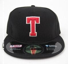
Multiple Turn Back The Clock Game Caps Now Available In Polyester
Aside from the Angels "Flashback Friday" caps that were released recently, multiple caps for this season's "Turn Back The Clock" games have been released in the modern 100% polyester "Cool Base" style. Availability varies, and they can be found at hatlclub.com, ecapcity.com, and the mlb.com shop. Here are the caps that have been released to the general public thus far:

Tampa Bay Rays as the 1940s "Tampa Bay Smokers"

1940s St. Louis Cardinals

Los Angeles Dodgers as the 1940s "Brooklyn Dodgers"

Early 1980s Seattle Mariners

Washington Nationals as 1930s "Washington Senators"

1970s Atlanta Braves, made for the "Civil Rights Game"

1930s San Diego Padres "Pacific Coast League"

1970s/80s Philadelphia Phillies

Early 1970s Pittsburgh Pirates

Kansas City Royals (I can't find any further information, any help is appreciated)

1960s Baltimore Orioles
More caps are expected to be released throughout the season, I will post any more caps that are released here on the Ballcap Blog. Certain Turn Back The Clock caps haven't been released to retail (yet), such as the 1918 caps that the Cubs and Red Sox wore, and the 80s Padres "Taco Bell" cap.

Tampa Bay Rays as the 1940s "Tampa Bay Smokers"

1940s St. Louis Cardinals

Los Angeles Dodgers as the 1940s "Brooklyn Dodgers"

Early 1980s Seattle Mariners

Washington Nationals as 1930s "Washington Senators"

1970s Atlanta Braves, made for the "Civil Rights Game"

1930s San Diego Padres "Pacific Coast League"

1970s/80s Philadelphia Phillies

Early 1970s Pittsburgh Pirates

Kansas City Royals (I can't find any further information, any help is appreciated)

1960s Baltimore Orioles
More caps are expected to be released throughout the season, I will post any more caps that are released here on the Ballcap Blog. Certain Turn Back The Clock caps haven't been released to retail (yet), such as the 1918 caps that the Cubs and Red Sox wore, and the 80s Padres "Taco Bell" cap.


That Phillies hat is awful. It looks nothing like the 70s-early 90s logo, way too fat. Why bother turning back the clock if the representation is not accurate?
ReplyDeleteThat being said, the Pirates hat is beautiful and that is the closest New Era has ever come on the old Brooklyn logo. Still not as good as the old Mitchell & Ness version, but certainly better than anything else made in the last 15 years.
ReplyDeleteOrioles cap has the logo from 1977-1988, not the 60's. Braves hat never had blue stitching on the white front panel, it was clear.
ReplyDeleteYea,these aren't great. I bought an orange Houston Astros low profile cap at Minute Made Park last month. Fits good but it's polyester not wool. It does have green under the bill with a white cotton sweat band. I wish the Rangers would come out with a better red & blue cap from the 70's than the one offered at the Ballpark now.
ReplyDeleteThe red "Royals" cap is probably a KC Athletics.
Yeah, the KC has is an Athletics hat, not Royals.
ReplyDeleteActually the Kansas City hat is for the Monarchs. Not the Royals or the Athletics.
ReplyDeleteThe KC one is the Kansas City Monarchs. Which is from the Negro Leagues.
ReplyDelete